Opposites Attract: Embracing Unexpected Colour Pairings this Valentine’s Day
Valentine’s Day is often associated with classic, complementary colour pairings—deep reds alongside pretty pinks. But this year, we're highlighting the lesser known, yet equally captivating, colour combinations.
According to colour theory, opposites on the colour wheel enhance each other’s vibrancy, creating dynamic tension that makes each shade appear more vivid and striking. As the saying goes, "opposites attract," so take a look at the unexpected colour pairings we’ve spotlighted — where bold contrasts come together to form stunning results.
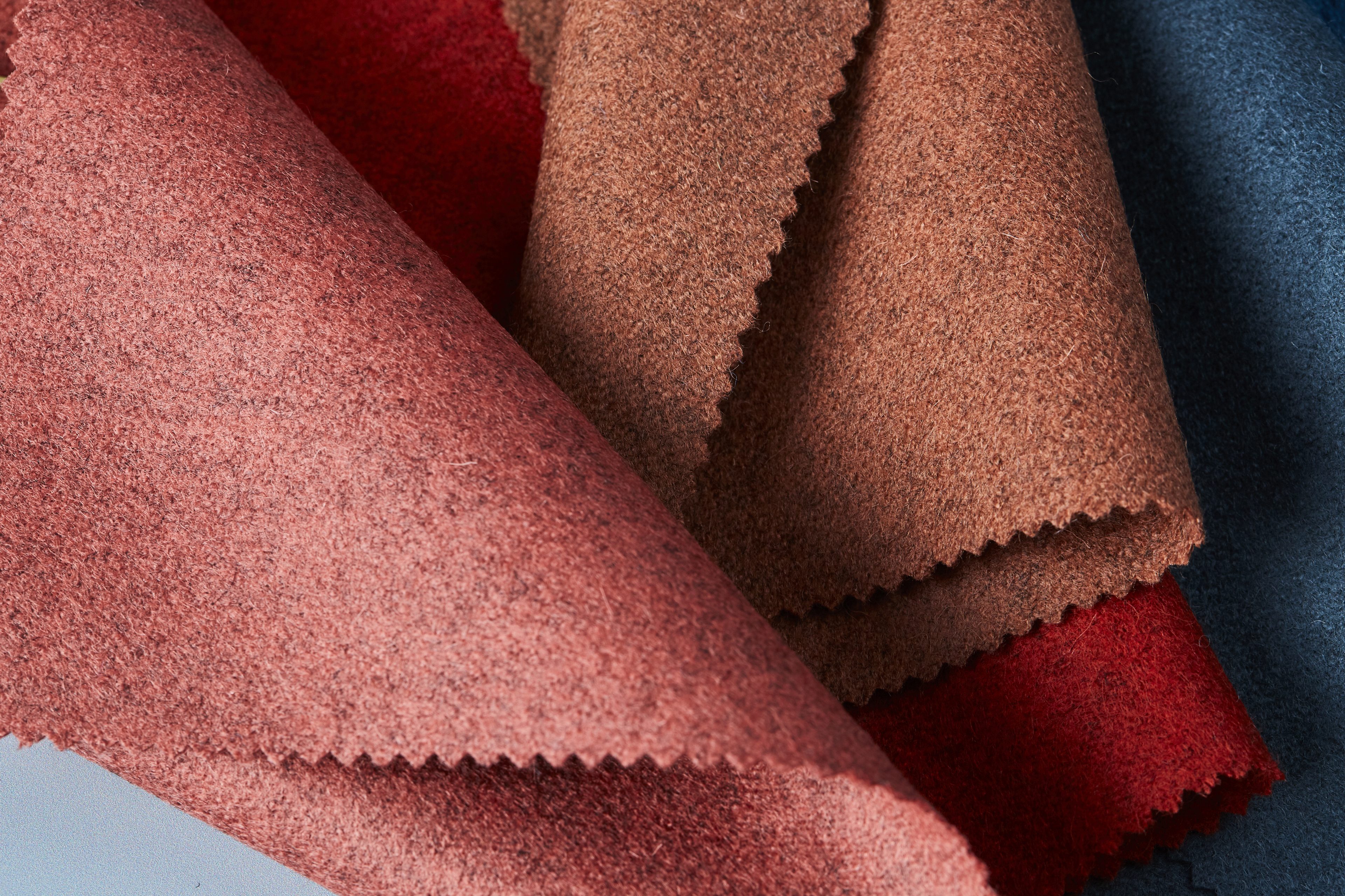
Paprika Red & Emerald Green: A Bold, Passionate Affair
Red, the colour of passion, intensity, and love, finds its perfect counterpart in green, a hue associated with balance, renewal, and nature. This high-energy combination is bold and fearless, creating a visually arresting impact. Whether it’s deep ruby against emerald or fiery scarlet with a fresh lime tone, red and green work together to command attention. In textiles, this pairing can be used to create striking accent pieces or layered in softer tones for a more muted, sophisticated effect.
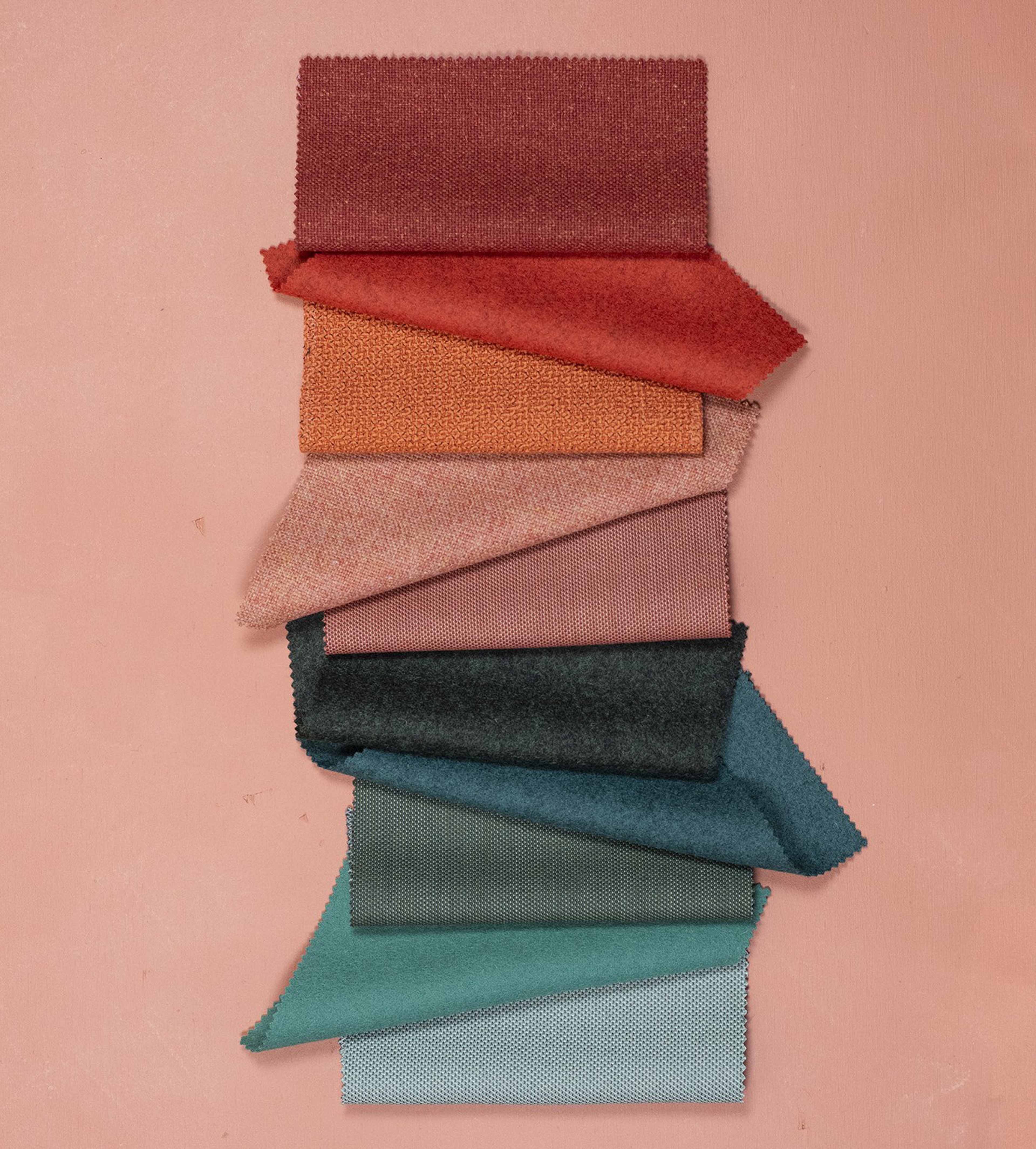
Mustard and teal: An eclectic duo
Mustard, with its deep golden tones, radiates warmth, while teal, a rich blue-green, offers a refreshing depth that grounds and balances the vibrancy of mustard. This unexpected pairing creates a bold yet sophisticated contrast, evoking a sense of retro charm with a contemporary edge. Mustard and teal work together to add both energy and refinement to a space.
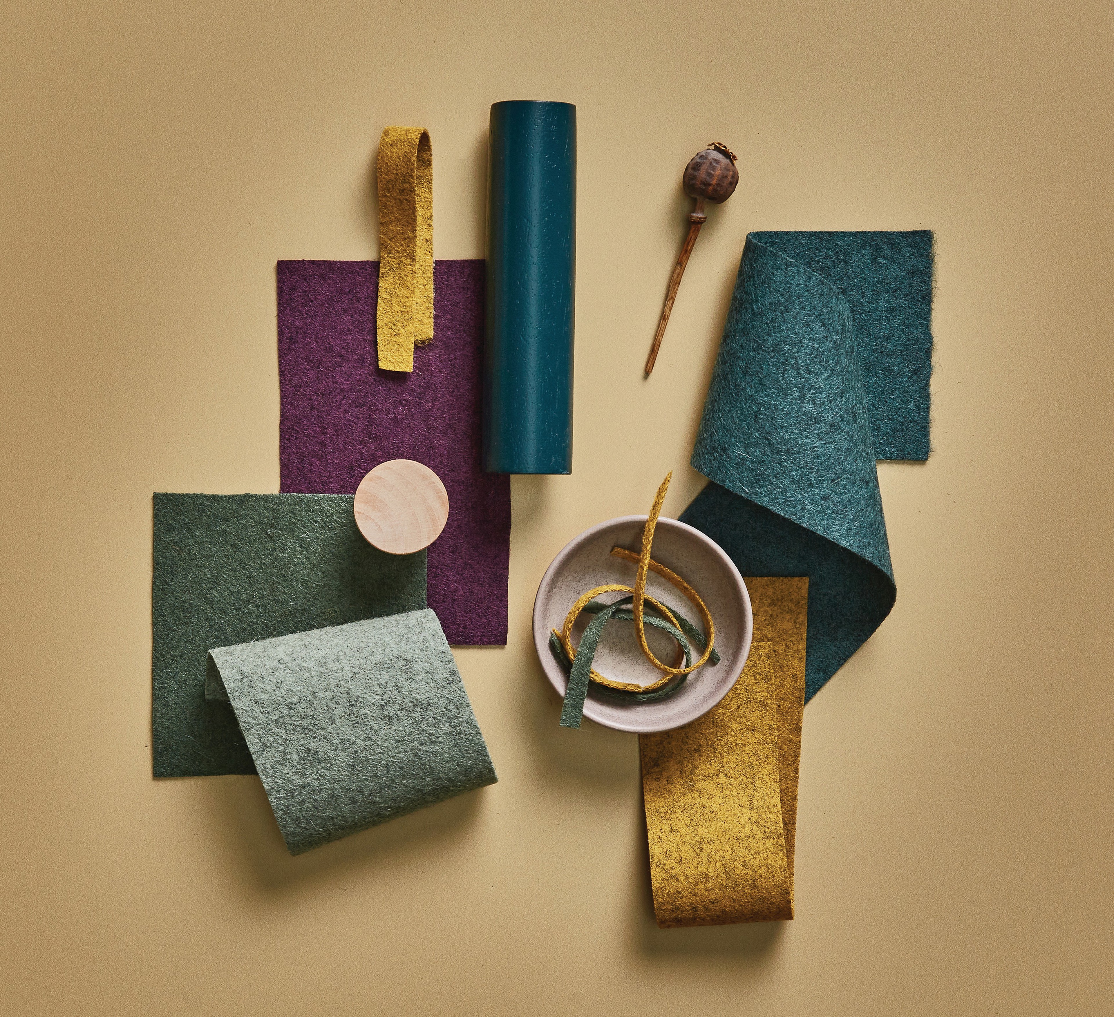
Terracotta & Violet: A Rich and Regal Contrast
Burnt orange, with its warm, earthy depth, radiates energy and vibrancy, while purple, a colour often associated with luxury and creativity, adds a sense of richness and drama. Together, these hues form a bold and sophisticated pairing, striking a balance between warmth and opulence. A perfect choice for embracing colour with confidence.
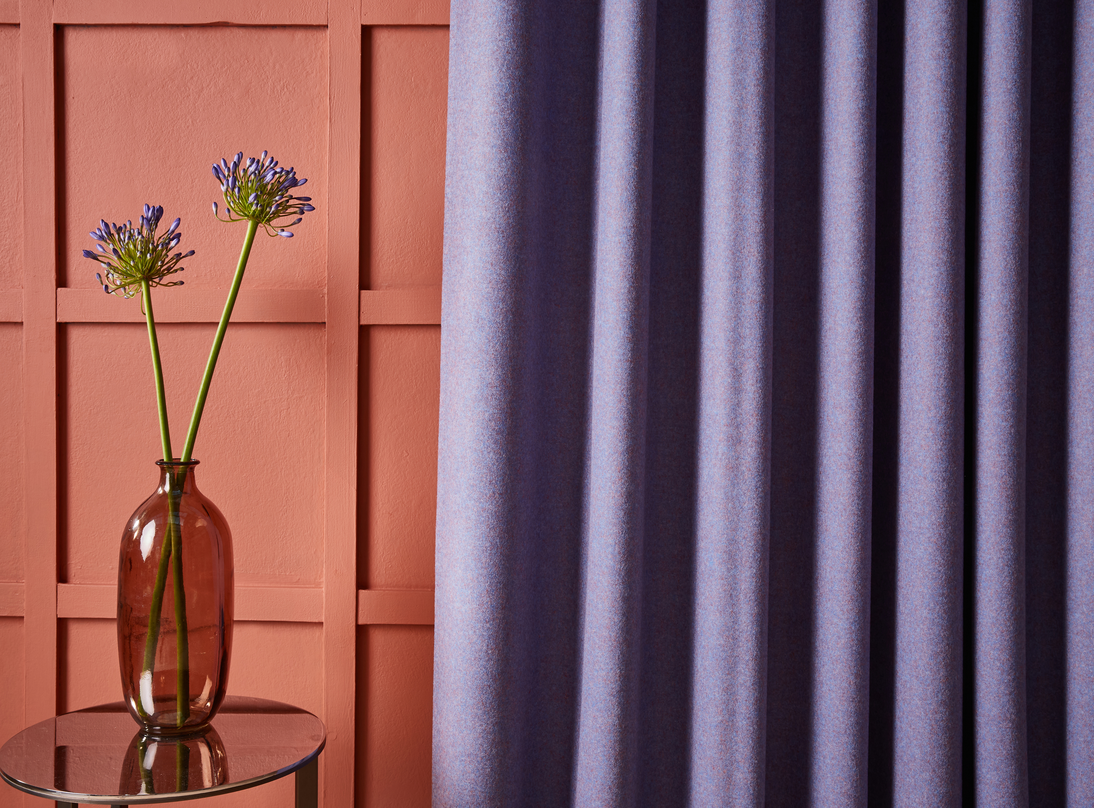
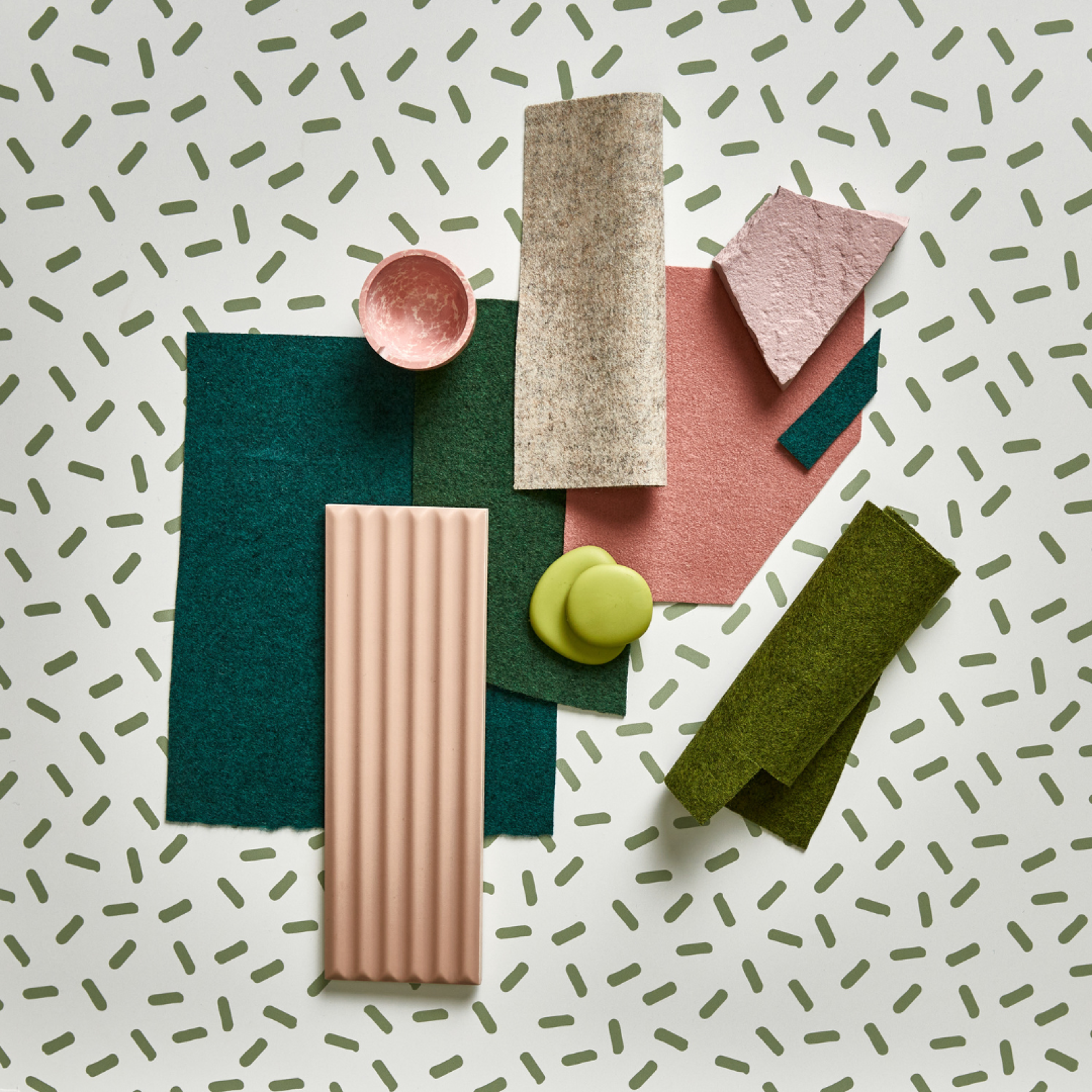
Blush Pink and Forest Green: A refreshing duo
The gentle warmth of blush pink softens the crisp energy of forest green, resulting in a balanced and inviting atmosphere.
Whether used in textiles, furnishings, or accessories, this combination evokes a sense of modern sophistication with a playful, dreamy edge.
At Camira, colour is our passion and this Valentine’s Day we’ve loved stepping outside the conventional and embracing the beauty of contrast—where opposing colours come together to form strikingly beautiful results.